


Data Center Analytics: Top KPIs Chosen by Experts
Today’s data centers generate a lot of data. Intelligent rack PDUs and other metered power infrastructure, environmental sensors, and the constant change in modern data centers all contribute towards a massive volume and variety of data. But data center professionals don’t have the time to collect all the data from its sources, analyze it, and derive insights from it that improve their data center operations. With legacy management tools like Excel and Visio, it’s a monumental task that takes resources away from more strategic projects.
That’s why modern data center managers deploy second-generation Data Center Infrastructure Management (DCIM) software that provides zero-configuration data center analytics. DCIM software automatically collects, stores, trends, and reports on all the data your devices generate to transform it into actionable insights with no tedious configuration effort required.
In a recent customer workshop focused on data center analytics, leading customers from The University of Chicago, NBCUniversal, and Vodafone shared their favorite dashboards, charts, and data center KPIs that they track to improve uptime, efficiency, and productivity.
The University of Chicago’s Favorite Data Center Analytics
The University of Chicago’s data center footprint includes 14,000 square feet of space spanning five locations, over 400 cabinets, and 450 communication closets. They have 3.5MW of mission critical space and rack densities can reach as high as 35kW.
When designing a dashboard for The University of Chicago’s operations center, Abe Shaker, Monitoring and Reporting Engineer, took into account the physical space and video wall where it would be displayed.
“We wanted things that resulted in visual cues, something that resulted in little or no user interaction in order for them to take action on something,” said Shaker. “I wanted to have visual cues to let them know, just by taking a glance at this dashboard, if something was going on.”
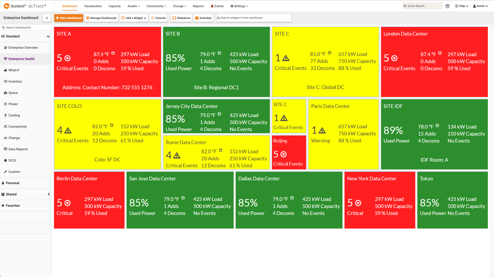
Health Tiles
The University of Chicago’s data center dashboard features an arrangement of health tiles that display the overall health for each of their six data rooms with easy-to-understand red-yellow-green color coding.
“They let you know whether there is a critical, major, or no alarms based on the color and the look,” said Shaker.
With the health tile widget, Shaker can mouse over the temperature on any tile to see which cabinet has the hottest inlet temperature. He can then drilldown into the cabinet and device details to see what the alarm was such as a sensor that reported a temperature below the critical threshold that was set.
“Another cool view that you can pop out from this health tile is, if you were to click on the alarm indicator itself, it will take you to the visualization tab and it will actually bring up the room and let you know which cabinets happen to be in alarm in that space,” said Shaker. “Immediately, just from one click, if the operation center happened to be looking up at the video wall, they’ll see the health tile turned red. You can click on it… and see exactly which ones are in alarm and where.”
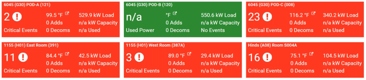
Item by Class
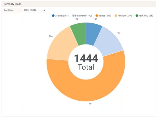
The University of Chicago uses their dashboard to track their progress for populating data in their DCIM system. The Items by Class chart shows them how many rack PDUs, data panels, and IT devices are in each location. With this information, they can know how much work they have to do to get a location fully populated to more easily manage that location.
“One of the rooms we still haven’t really approached yet is Pod B. I can immediately tell that only have 2 rack PDUs indicates that we really need to go ahead and focus on getting Pod B going. It shows us where we’re at with project status by location,” said Shaker.
Item Audit Trail
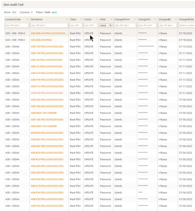
The Item Audit Trail widget keeps track of what has changed in the environment, who changed it, and when. The University of Chicago finds this widget particularly useful when having issues logging into a device.
“We can see at what point somebody managed to change a password on a rack PDU,” said Shaker. “If the username and password isn’t working for us, we can go ahead and look this up and [see] on July 18th the password for PDU in Pod C was changed.”
“More often that not, if something was working and it no longer is, then something was changed somewhere,” said Shaker. “This is a really good way that you can keep track of it. Since it is a SQL widget, any one of those fields can be programmed to be sorted in a specific fashion… It’s very customizable.”
Average Data Center Temperature
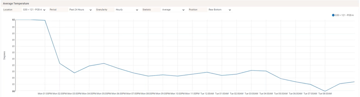
The University of Chicago has identical dashboards for each of their six rooms so they can track the health and capacity of each.
The Average Temperature trend chart shows the temperature of the room over time. The time period, granularity, and sensor position can be adjusted to understand the environmental conditions of the room.
Free Rack Units Trend
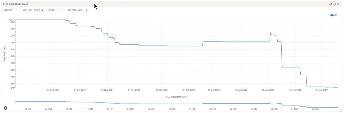
Shaker tracks the trending amount of available rack units track the progress of populating the DCIM database.
“When you initially build out a room, you add a bunch of cabinets and they’re all empty,” said Shaker, “The number of rack units that you have is significantly higher than one that has been populated. You can see and keep track of your progress. As we go ahead and add devices and add PDUs to the room, you can see the number decreases. This is a good indication that you are building out the application properly.”
The chart is also used to aid infrastructure project management and capacity planning.
“Let’s say a server team came in and says, ‘We have some equipment coming in and we need 200 rack units of space.’ At-a-glance, you can really tell if that space exists or not,” said Shaker.
NBCUniversal’s Favorite Data Center Analytics
NBCUniversal has over 300 locations in over 25 countries. This includes 2,500 racks, thousands of PDUs, over 200 data panels, 3,500 network devices, and over 8,000 servers.
To manage their data centers and track their documentation progress, Manny Peralta, Manager East Coast Data Centers, heavily leverages his DCIM tool’s out of the box charts and widgets that require no manual configuration effort. He also has custom widgets created by his DCIM vendor for his unique reporting needs.
Like The University of Chicago, NBCUniversal uses identical dashboards for each of their locations so they can easily see their most important KPIs for any site.
Cabinet Space Remaining
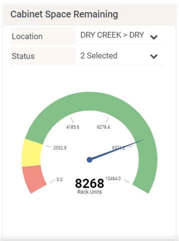
Intelligent space capacity planning is key to navigating data center expansion and optimization. NBC Universal tracks how much cabinet space they have left in each location to know their capacity to deploy new equipment.
“This is a widget that everyone should be using,” said Peralta.
Hottest Racks
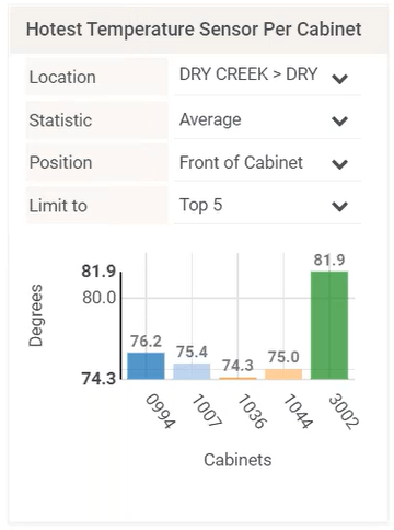
Hot spots pose a threat to IT equipment and can increase outages. NBCUniversal proactively monitors the potential formation of hot spots by tracking what their hottest racks in each location are.
“We want to keep track of the hottest cabinets that we have to make sure that everything is within a manageable temperature,” said Peralta.
Historical Item Counts
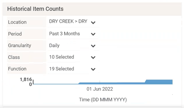
By tracking how many assets are in the DCIM database with a Historical Item Counts chart, NBCUniversal is able to visualize how much of their physical infrastructure is populated and ready to be managed remotely.
“It’s a good visual aid to see how far you are from being 100% documented,” said Peralta. “If you think about it, you will never be 100% documented. dcTrack is a living environment, so you’ll never be 100% done.”
While this chart is just one example, NBCUniversal leverages many different charts for different views of their progress getting data into the system.
Circuit Trace Table
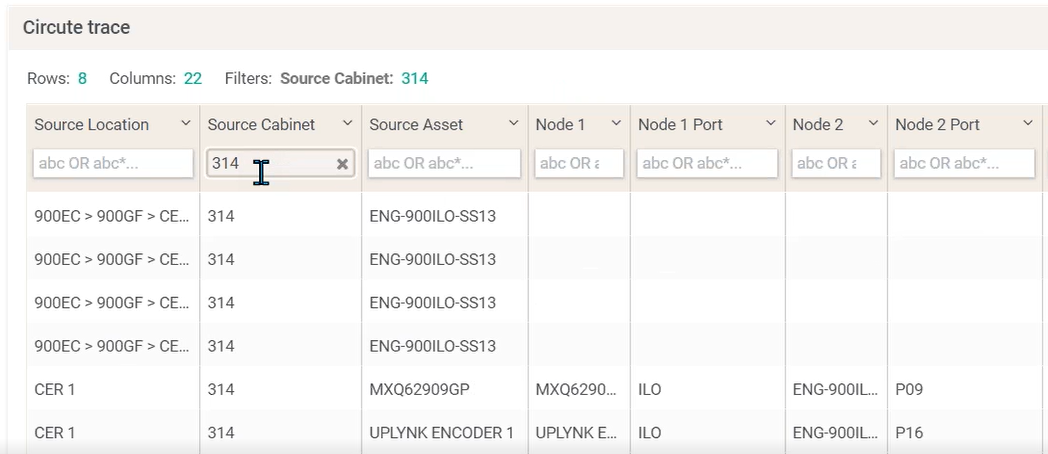
NBCUniversal uses a dashboard widget that provides a sortable, searchable, and filterable list of every single circuit in their database.
“If you have a server or a location that you need to find out, ‘What circuits do I have in there?’ you could actually just go in here and find out,” said Peralta.
They also use it to search for the circuits of any specific device.
“It gives you how many connections you have in that device and the endpoint on the other end,” said Peralta. “When you want to trace a cable, you can just go in here and look at the connection and you could export it to a spreadsheet and send it out.”
Vodafone’s Favorite Data Center Analytics
Vodafone is one of the largest international telecommunications companies with over 300 million customers globally. They are one of the top five internet providers and the largest submarine cable operator in the world.
In the UK alone, they have 69 data center locations, 10,000 racks, 200,000 devices, and 200 internal and external customers.
Andrew Marsh, Senior Manager for Infrastructure and Data Centers, leverages data center analytics to help him manage the infrastructure in those locations including the servers, storage, backup, network, and site management.
Health Map
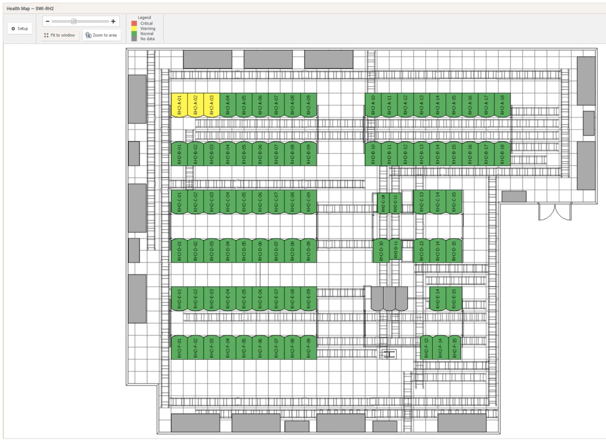
As with The University of Chicago, Vodafone displays their DCIM dashboards in their operations center. They show their health map which shows the floor map with easy-to-understand color-coding to display the health status of all their racks.
“You’ve got normal which is green, warning [is yellow] which means something is not quite green but not quite red, and then red obviously which is critical,” said Marsh. “This allows our guys to use this in their individual screens to drill down into more detail if they need to see what the issues are.”
For example, Marsh can click on a yellow rack and see that a temperature sensor is over the warning threshold.
Energy Costs
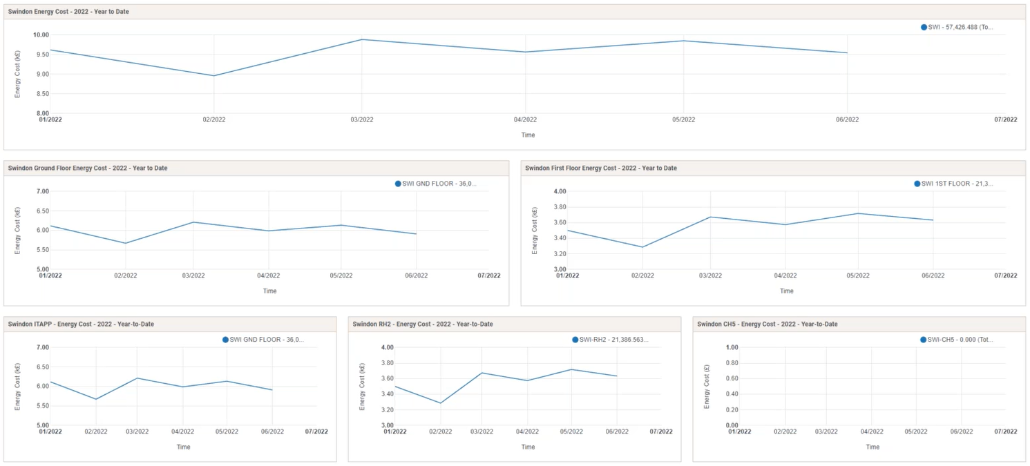
Vodafone has sustainability objectives they must meet, and are diligent about knowing where their energy costs are coming from. To track this, they have an Energy Costs dashboard.
“This gives us a simple report on a page which shows us the amount of power cost that we’re using per site, and then it breaks down into the individual floors within that site and then the individual rooms within those floors,” said Marsh. “It gives us a quick, easy snapshot per month of what we’re doing from a power perspective.”
What If Analysis
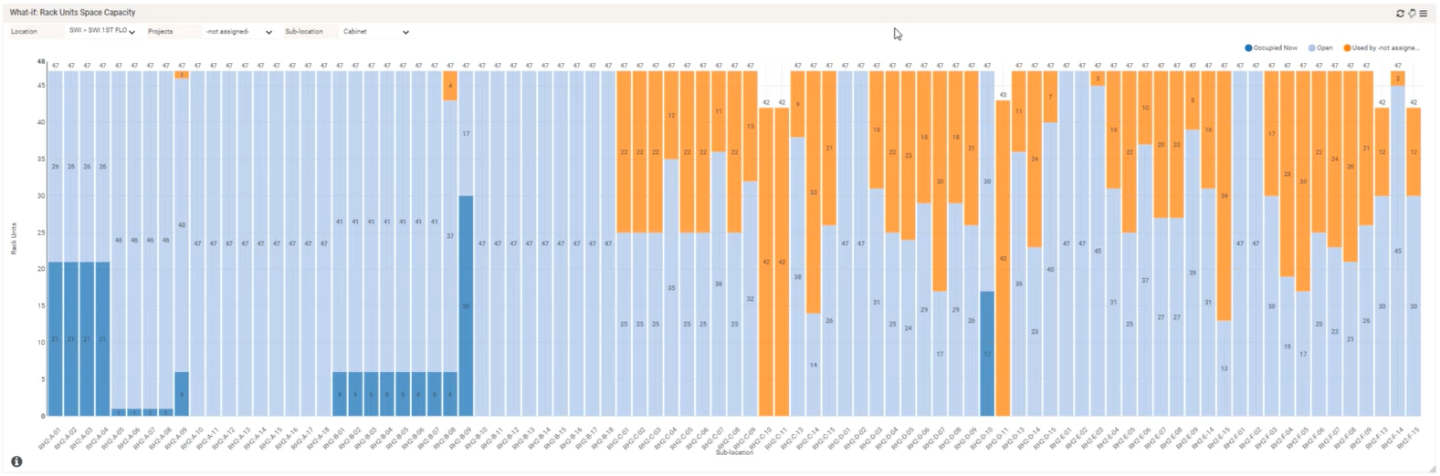
Vodafone uses what if analysis charts for space and power capacity to understand the potential net impact of changes in their data center without impacting the equipment in use.
“We use this to work out when we have a new device to put into a rack within a room and which rack to place it in,” said Marsh. “We’re trying to evenly balance out the capacity across the racks within the room.”
Energy, Temperature, and Power Trends
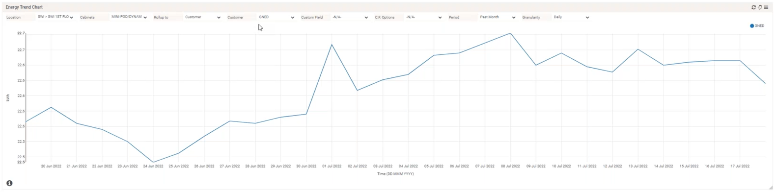
Charging internal or external customers for the energy they use is an effective way to drive more efficient behavior from them. To achieve this, you need accurate data on their energy consumption. Vodafone uses trend charts for this.
“We’re using this to monitor the power usage for a particular customer. This shows us how much energy has been used at any one point by that customer across our data centers,” said Marsh. “For a specific rack… we can basically see the individual device in that rack and how much power each of those devices used over the past month. We’re using this to work out what our costs are so we can attribute those to the customers ongoing to claim the cost of the energy back.”
Delta T Per Cabinet
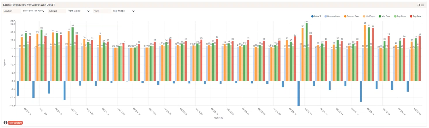
Knowing the Delta T, or difference in temperature between two sensor readings at different locations of a cabinet, can help you increase efficiency and know where you have capacity to deploy equipment.
Vodafone leverages a Delta T Per Cabinet chart to easily see all their cabinet temperatures in one place.
“This allows you to have the front and the back of the cabinet monitored in three different locations: top, middle, and bottom of the rack. It gives you a Delta T. That is basically the temperature coming into the front of the rack being heated up by the devices in the rack and then the temperature coming out,” said Marsh. “We use that with the what-if scenario so we can make sure that we can make sure that we try to get the right equipment in the right rack.”
Cooling Capacity
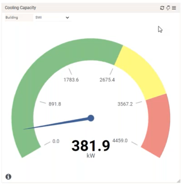
Vodafone uses a Cooling Capacity gauge to easily understand how much cooling capacity they have in each room and how much they are using.
“That’s quite useful for us to make sure that we’re not overburdening our data center with too many hot temperatures inside,” said Marsh. “We want to keep the heat out and the cold in.”
Try Our Plug-and-Play Dashboards
Want to try the same DCIM solution that The University of Chicago, NBCUniversal, and Vodafone use to manage their data centers? Get your free test drive now and explore our 100+ zero-configuration dashboard charts and reports.